When a tech company commissions its own typeface, you’re usually looking at one of two scenarios: either there’s a branding team with too much budget and too few ideas, or there’s genuinely something to say about the character of the brand that no existing font could express. Anthropic, the company behind Claude, seems to have taken the second path.
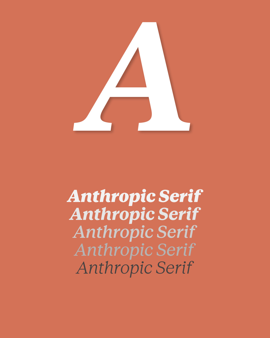
The Anthropic Type family is a complete suite with three subfamilies — Anthropic Serif, Anthropic Sans, and Anthropic Mono — each available in text and display variants. This isn’t a vanity exercise: it’s a structural decision about how they want to communicate across every touchpoint.
Anthropic Sans · Functional Without Being Boring
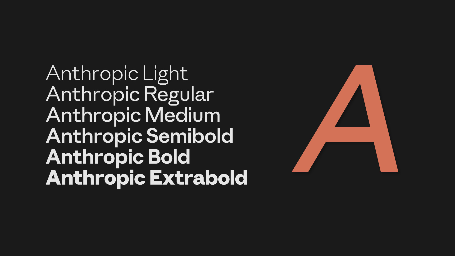
The sans-serif branch of the family is where the brand lives day to day: interfaces, documentation, labels, body text. The design avoids the generic minimalism of so many corporate grotesques and offers something with more warmth.
Serif + Sans · The Conversation Between the Two
What’s interesting isn’t each family on its own, but how they work together. The Serif brings warmth and editorial authority; the Sans brings functional clarity. When mixed — headlines in Serif, body in Sans, or the reverse — you get that productive tension that distinguishes well-thought-out type systems from those that simply “use two fonts.”
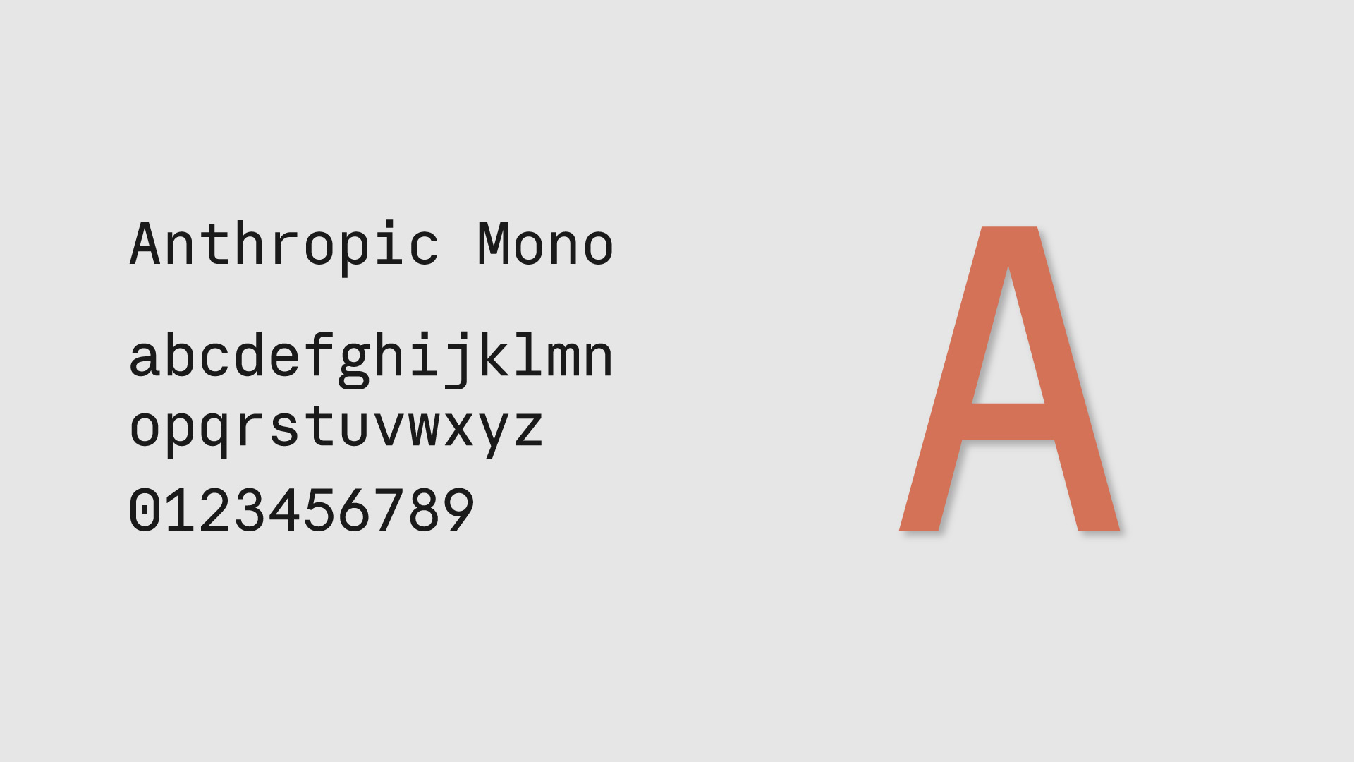
Anthropic Mono · The Third Member
A corporate type family for an AI company without a monospaced option would make no sense. Anthropic’s Mono shows up where all monospaced type shows up: code, data, technical references. It’s available at least in Bold for display use.
Display vs. Text · A Distinction Most People Ignore
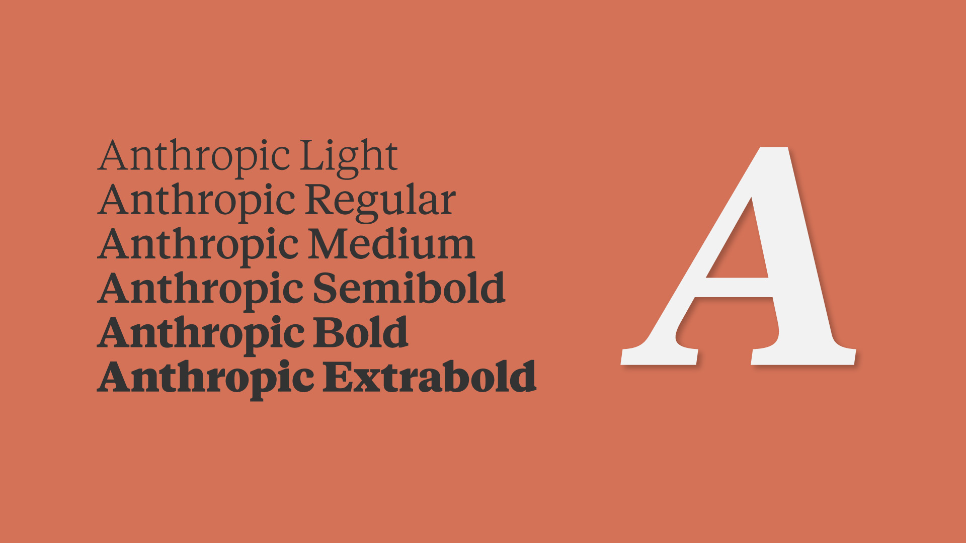
Each subfamily exists in two optical sizes: Display and Text. It’s a technical detail that many projects overlook, and it’s the difference between type that looks fine at any size and type that looks perfect at the right size.
Display variants are optimized for large sizes (headlines, hero text, display): sharper forms, tighter spacing, greater stroke contrast. Text variants prioritize readability at small sizes: slightly more open forms, a more generous x-height, lower contrast. It’s the same distinction that separates Garamond Premier Pro from Garamond Premiere Pro Caption — and that separates serious type systems from ones that simply scale up or down.
Behind the Design · The Creators
Every great typeface has real names behind it. In Anthropic’s case, the complete visual identity was developed by Geist, a digital design studio based in Portland, Oregon, which worked with the company from its early stealth days all the way through the public launch of Claude. A collaboration spanning more than two and a half years, covering everything from the logo to the full UI component system.
But the specific type commission went to another hand: Chester Jenkins, from the type foundry BSPK, was the type designer responsible for creating the Anthropic Sans and Anthropic Serif fonts. Jenkins is a seasoned typographer with a track record of demanding corporate commissions, and the family reflects that level of craft: this isn’t a rushed adaptation of something existing, but a system built from scratch for a brand with very specific needs.
Not every studio can say it built the identity of one of the world’s most influential AI companies from day zero. Geist can.
This kind of collaboration — a branding studio working hand in hand with a specialized type designer — is how things get done right. The studio understands the brand; the typographer understands the letters. Together, the result is a family that could never have come out of a font generator or a generic corporate license.
Why Design Your Own Typeface?
For Anthropic, it makes strategic sense. They’re a company whose core product is text — Claude generates text, processes text, lives in text. The fact that the brand’s visual identity is built on a proprietary, carefully designed type family isn’t a cosmetic detail. It’s systemic coherence.
Looking at the fonts, you can see a commitment to the tension between the classical and the functional: the Serif has history, the Sans has the present, the Mono has technical context. All three coexist without crowding each other. That’s not easy to pull off, and it’s a sign that whoever designed it knew what they were doing.