Downloading the right fonts for Reels can make the difference between a video that gets ignored and one that stops the scroll instantly. In this article, we present the 8 Best Fonts for Reels 2026 – Part 1, a carefully selected collection of modern, creative, and highly readable typefaces designed for Instagram Reels, vertical videos, and content creators who want their text to stand out.
You’ll find both free and premium fonts for Reels, ready to download and perfect for Instagram, TikTok, Stories, and any short-form video format where every second matters—and every letter counts. Each font in this list was chosen for its strong on-screen readability, trendy style, and compatibility with popular video editors and design tools.
If you’re looking to download fonts for Instagram Reels, improve your animated text, or give your videos a more professional and eye-catching look, this guide is exactly what you need. This is the first part of a series dedicated to the best fonts for social media in 2026, helping you create better content with smarter typography choices.

GC EpicPro
If you want to take your Reels to the next level and stop using the same overused fonts everyone else relies on, there’s a tool that can truly change the game. To put everything we’ve covered into practice with professional quality and effortless results, you need to try GC EpicPro.
GC EpicPro gives you access to a powerful collection of modern, high-quality fonts designed specifically for social media content, including Instagram Reels, TikTok, and vertical video formats. With clean styles, bold display options, and creative typography choices, it helps your text look sharper, more dynamic, and far more engaging.
Instead of wasting time searching for random fonts or struggling with compatibility issues, GC EpicPro offers a complete solution for creators who want fast, professional-looking results. Whether you’re designing animated captions, eye-catching titles, or branded text overlays, this tool makes the process simple and effective.

Hago
Hago is not your typical boring sans-serif. It features a neo-grotesque personality with clean curves and geometric cuts that make it feel fresh, modern, and highly professional. This font works perfectly for Reels that aim for a clean, minimalist, or “Tech-Vlog” aesthetic, where clarity and style need to go hand in hand.
Thanks to its balanced proportions and excellent legibility on small screens, Hago performs incredibly well in fast-paced vertical videos. Whether you’re adding subtitles, bold headlines, or short callouts, it keeps your text sharp and easy to read without stealing attention from the visuals.


Bebas Neue
Bebas Neue is a sans-serif font based on the original design by Ryoichi Tsunekawa. Its main trait is simple but powerful: it’s a condensed, all-caps typeface that was basically born to shout… politely. Think of it as the confident friend in your group who always speaks clearly, takes up very little space, and somehow still grabs all the attention.
Because of its narrow structure, Bebas Neue is perfect for bold titles and punchy headlines in Reels where screen space is limited but impact is not optional. It lets you fit more words on the screen without making your video look like a crowded PowerPoint slide from 2007.
This font works especially well for motivational quotes, sports content, announcements, and anything that needs a strong, energetic vibe. If your Reel needs to feel loud, dynamic, and impossible to ignore—but still clean and professional—Bebas Neue has your back, in capital letters only.

Helvética
If there’s one font that defines perfection, it’s Helvetica. As an experienced blogger, here’s my rule: if you’re ever unsure which font to use, just go with Helvetica. It’s the gold standard in graphic design and the secret weapon of some of the world’s biggest brands—Apple, NASA, Jeep—you name it.
Bringing Helvetica into your Reels isn’t just an aesthetic choice; it’s a statement of professionalism and absolute clarity. Its clean, neutral lines make your text readable in any situation, whether your audience is watching on a tiny phone screen or a giant monitor.
And let’s be honest: Helvetica is like that dependable friend who never overcomplicates things, always looks sharp, and somehow makes everything else around it look better. Use it, and suddenly your captions, titles, and overlays feel effortlessly polished—without you even breaking a sweat.

Playfair Display
If you want your Reels to exude luxury, elegance, and an editorial vibe, Playfair Display is your go-to font. As a typography expert, I can tell you this: it’s the exact opposite of generic—pure sophistication in every stroke. This is the typeface you’d see on the cover of Vogue or on a Michelin-starred restaurant menu.
Its high-contrast letters and delicate curves make every word feel intentional and refined. Perfect for fashion, lifestyle, or any content where you want to impress your audience without saying a word. Think of it as the font equivalent of wearing a tailored suit while casually sipping an espresso—effortless style with a hint of flair.
Playfair Display is also one of the most popular fonts for TikTok subtitles, making it perfect for Reels, Stories, and other short-form videos where readability and elegance are key. Its clean yet sophisticated look ensures your captions stand out without overpowering your visuals. If your goal is to make viewers pause, admire, and maybe even double-tap your Reel out of sheer admiration, this font will do the heavy lifting for you.

Times New Roman
Wait a moment! As a typography expert, I have to make a small—but very loving—correction: the font we’re talking about is the legendary Times New Roman. While we sometimes call it “the news font” (because it was originally designed for The Times newspaper in London), its official name is the one that truly made history in design.
Using Times New Roman in your Reels is actually one of the hottest trends this year. Why? Because “traditional” is the new “cool.” Its classic serifs and perfectly balanced letters give your text a timeless elegance that feels both familiar and surprisingly fresh.
Times New Roman works especially well for Reels with quotes, captions, or storytelling content—anything where you want your words to feel authoritative yet approachable. It’s like wearing a vintage suit to a modern party: instantly classy, subtly bold, and impossible to ignore.

EB Garamond
If you’re looking for the pinnacle of intellectual elegance and “Quiet Luxury” style for your Reels, you need to know EB Garamond. As a typography expert, I can tell you this: it’s not just a font—it’s one of the most prestigious typeface families in history, revived for the digital age. If Times New Roman is a newspaper, EB Garamond is a limited-edition art book.
Its refined serifs and balanced proportions make every line feel deliberate and sophisticated. Perfect for Reels that feature storytelling, quotes, or any content where elegance needs to speak louder than flashy effects. This font conveys a sense of heritage, craftsmanship, and quiet authority—all while keeping your captions readable on small screens.
EB Garamond is ideal for creators who want their text to feel cultured without ever appearing pretentious. Think of it as the typeface equivalent of sipping single-origin coffee in a minimalist library: understated, refined, and effortlessly classy.

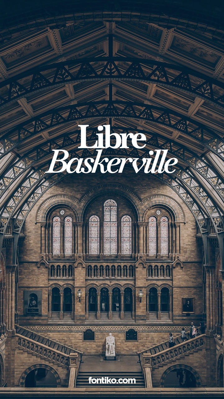
Libre Baskerville
If you’re looking for a font that says, “I have something important to say”—but wrapped in a warm, approachable vibe—Libre Baskerville is your best ally. I promise, this is the go-to font for creators who want to convey wisdom, trust, and a classic aesthetic without looking stuck in the past.
Libre Baskerville was designed specifically for on-screen reading. Unlike older serif fonts that can look fuzzy on a phone, this typeface is robust, clear, and full of personality. It’s the font equivalent of that wise friend who always gives solid advice… but somehow makes you laugh while doing it.
Perfect for captions, quotes, or any text in Reels that needs to command attention while still feeling approachable. With Libre Baskerville, your words won’t just be read—they’ll be felt.